The new iPhone 14 Pro and iPhone 14 Pro Max from Apple are packed with improvements. Still, the most noticeable change is that Apple decided to make the “notch” on the screen smaller, put a screen around the cutout, and call it “Dynamic Island.”
Surely Apple gave the camera cutouts a name to prevent them from being called something worse than the notch, as seen with the iPhone X, by the press and the public.
What makes Dynamic Island so unique?

On the other hand, Apple took advantage of the screen having two separate cutouts that can only be seen when the device is tilted and made software to hide the cameras without changing how the touchscreen works.
The fact that Apple did not accomplish what was widely anticipated is not shocking. When, if ever, has it happened? The digital titan is known for making bold, unexpected moves. Even in its simplicity, Dynamic Island came close to realizing this goal. It’s one of those additions that seems like the most logical way to handle a situation. This makes the pill-shaped cutout a treasure trove of information instead of a bother. Android users are trying to spoof the function despite widespread criticism that it serves no use. What are we waiting for? Should we take in its splendor?
Which apps use Dynamic Island?
Only a handful of Apple apps have Dynamic Island integration, but that number is only expected to rise. When you use Face ID to unlock your iPhone or when you connect your iPhone to a charger, a wonderful animation takes place within the island. Both of these are examples of rather simple interactions.
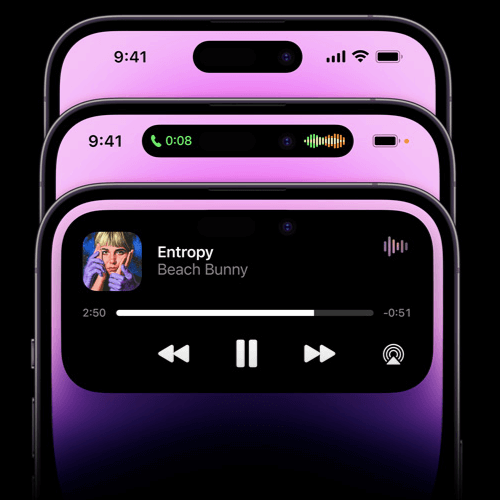
Get out your phone and play tunes using your preferred music app, such as Apple Music or Spotify. Then you may close the app, but it will continue to work in the background.
To the right of the screen, Dynamic Island will display a waveform animation corresponding to the music being played, and the album cover art for the currently playing song will appear on the left.
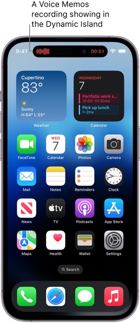
New apps I learn about all the time that use Dynamic Island include FaceTime, Apple Pay, Screen Recording, the hotspot indication, and AirPods.
What exactly is Dynamic Island?

The name may sound strange at first, but it fits the pill-shaped front panel of the screen perfectly. After all, it’s a separate territory, dangling in the middle with the screen on all sides. In addition, even though it’s all an illusion, the effect is lively.
You’ll agree that the wording is a bit odd. What sleight of hand would I have to name it? Because that is precisely how it makes you feel. You know it’s not genuine when you watch a magician produce a rabbit from a hat or make an object vanish into thin air. It’s not, but you’ve convinced yourself that it is. To put it plainly, that’s what Dynamic Island is like.
The region around the opening houses the sensors and camera is known as “Dynamic Island.” The surrounding pixels are used to send alerts, which can look different depending on the type of alert. But the hardware works so well with the software that the cutout seems to get bigger to fit all the animations. Indeed, such a thing can never happen. To make hardware dynamic, wouldn’t some magic be required? That is precisely my point. In most cases, it does not involve magic, but it does have the appearance of such.
The cutout doesn’t look like it’s part of the screen or the island from every angle.
Especially when you take it outdoors and into the light. There are small but clear differences between the real world and the magical halls of Hogwarts.
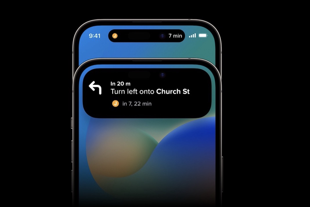
As it is, Dynamic Island’s potential isn’t fully realized in its current form. There will be moments when you won’t even notice its presence. Part of this is that independent app makers must catch up to get on the bandwagon. With so few available apps using this interface, adoption could be faster. This should improve, though, once Live Activities is included in iOS 16.1, and more third-party apps begin to support it.
Why doesn’t Dynamic Island act?
Until you have a background app that can use Dynamic Island and its notification system, the island won’t move and will look like your camera cutout. The shorter time it takes to move between applications would make multitasking easier with the help of Dynamic Island. You may recall when it was necessary to launch a separate program or use widgets to keep tabs on timers, music, and other such items. The good news is that you can now witness this action unfolding in real time on Dynamic Island. You can stay focused on what you’re doing without leaving the app or going to the home screen to check what’s happening.
Yet, if you don’t have anything else happening in the background, your Dynamic Island will remain still and unresponsive. If you need help getting the most out of Dynamic Island on your brand-new iPhone 14 Pro or Pro Max, it’s probably because you still need to utilize a compatible app that uses background activity.
You can see the full breadth of its current functionality below.
Using Dynamic Island: How to Interact
Timer settings, phone calls, Apple Pay purchases, AirPod pairing, and music management are all streamlined and discreet with Dynamic Island. When controlling on-screen events on the Dynamic Island, there are two main methods of interaction:
- If you tap on Dynamic Island, the app for which the status is displayed will launch immediately.
- If you tap and hold Dynamic Island’s icon for a while, the app’s controls will pop up.
Utilizing the Dynamic Island
Many built-in programs will demonstrate Dynamic Island in action. When you unlock your iPhone, an animation for Face ID will play, and you’ll see the island grow to accommodate it. When using Face ID to unlock the iPhone, the animation is much more understated than when using it in other apps.
We wonder if we need the Face ID app integration feature. The little rectangle up top may have accommodated its growth to a much larger square on the screen.
Set aside your judgments; at the moment, Dynamic Island can display various warnings.
Make use of a Suitable App
We advise beginning with a preinstalled app that is compatible with Dynamic Island. In this way, you may test if it works as expected, activate it, and put it to good use. Please follow the instructions below.
- Launch the Clock app and scroll to the bottom to use the Timer function.
- Swiping on the numbers allows you to set a timer for any duration on your iPhone. To make the most of this tutorial, we’ve decided to limit it to 15 minutes.
- When ready, press the Start button.
- Your iPhone 14 Pro or Pro Max’s timer has started. Your iPhone’s Clock app may be closed by swiping from the bottom up. Now that your timer has been relocated to your Dynamic Island, you may continue tracking it similarly.
- You can expand the timer widget on your Dynamic Island with a quick tap and patience. To temporarily stop the timer, press the symbol.
- You may press the X on Dynamic Island to cancel the current countdown.
- And that’s how you turn Dynamic Island on your iPhone 14 Pro or Pro Max with a compatible app.
At what point will Dynamic Island be compatible with other applications?
Expect upgrades to third-party apps to support Dynamic Island shortly. Developers of third-party apps are growing accustomed to and using Dynamic Island, a relatively new feature. Many apps may take time to develop new ways of interacting with Dynamic Island. Various third-party apps will have been designed to work with Dynamic Island by the year’s end.
The development of Dynamic Island has only begun, but it already looks like a useful addition. Plus, this is the pill of the future!


