AWS Management Console Receives a Visual Upgrade: A Comprehensive Overview
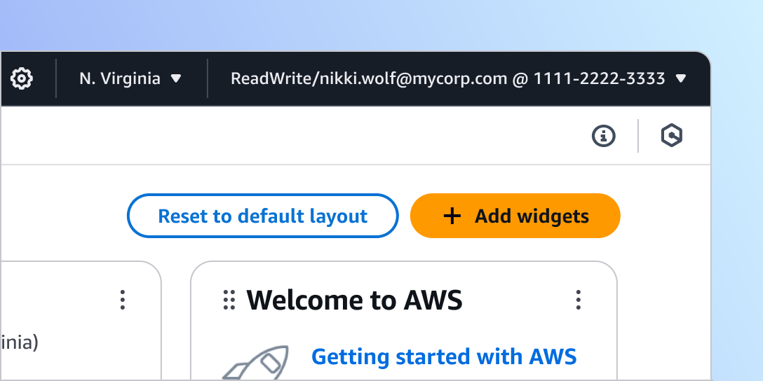
Amazon Web Services (AWS) recently announced an exciting visual update to its AWS Management Console, now available in preview. This update is implemented using the latest version of Cloudscape, AWS’s design system engineered to create seamless, inclusive, and meaningful user experiences on a large scale. This article will explore how this visual transformation enhances usability, maintains familiarity, and improves overall efficiency for AWS users.
Enhancing User Experience with Improved Readability
The AWS Management Console has undergone significant changes aimed at improving readability. The typography scale has been revised, and heading styles have been refined to establish a more robust visual hierarchy. This change allows users to quickly locate and comprehend the data they need. The update also includes a more prominent presentation of form field labels, which facilitates scanning and understanding. Key information in key-value pairs, navigation elements, and other components like expandable elements and tabs now stand out more distinctively.
Color usage has been optimized to create a vibrant palette that simplifies the interaction with various interface elements. Secondary buttons, links, tokens, and interactive states now feature a unified blue color scheme, enhancing task efficiency by making interactive elements easier to identify.
Streamlined Focus with Light and Dark Mode Enhancements
To support user focus, AWS reduced visual complexity by replacing drop shadows with a thinner stroke on primary content wrappers such as cards, panels, and containers. This change unifies border styles across components, reducing visual clutter and maximizing layout space. Shadows are now strategically used to emphasize interactive and transient elements, which simplifies the visual depth and reinforces content hierarchy.
The dark mode has also been updated to offer better differentiation between elements on the page. These updates include changes to the color ramp and enhanced contrast for interactive states across components, resulting in a more cohesive and user-friendly experience.
A Modernized Interface with Familiar Elements
AWS has modernized the interface while preserving the familiar elements that users recognize. The updated user interface features rounder shapes, brighter colors, and improved layout treatment, creating a smoother and more visually appealing experience. These enhancements make the interface easier on the eyes and contribute to a more pleasant user experience.
In addition to these visual improvements, AWS introduced a new set of illustrations and motion graphics to support visual storytelling. These additions adhere to the highest accessibility standards, ensuring that all users can benefit from the new features.
Optimized Information Density for Better User Interaction
The update also addresses information density by reducing unused space, allowing more content to be visible on the screen. Related data is now grouped more closely together, enhancing visual organization and enabling users to absorb more information at once. The new layout is centered and wider, optimizing the experience for larger screens and creating a more user-friendly environment within the AWS Management Console.
A notable addition is the introduction of a Toolbar, a new feature that provides easy navigation and access to contextual tools and features. This toolbar helps users perform tasks effectively while maximizing screen real estate for content display.
Consistency and Availability Across AWS Regions
The interface now boasts more dynamic and expressive colors, iconography, and shapes, delivering a unified and cohesive experience across all AWS services. These changes contribute to a more distinctive and consistent interface that enhances the overall user journey.
The visual update is currently available in selected consoles across all AWS Regions. Users can start exploring these enhancements by visiting the AWS Management Console. AWS plans to extend the update across all services, allowing users to enjoy a more readable, intuitive experience that boosts task efficiency.
Insights and Reactions from the AWS Community
The AWS community has responded positively to the visual update, with many users appreciating the enhanced readability and modernized interface. The improved focus and information density have been particularly well-received, as they contribute to a more efficient and user-friendly experience. The introduction of the Toolbar has also been praised for its ability to streamline navigation and improve access to essential tools.
As AWS continues to evolve its services, the focus on user experience remains a top priority. The visual update to the AWS Management Console is a testament to AWS’s commitment to providing its users with the best possible experience. By incorporating user feedback and leveraging the latest design innovations, AWS ensures that its services remain at the forefront of the cloud computing industry.
In conclusion, the visual upgrade to the AWS Management Console marks a significant step forward in enhancing user experience and task efficiency. With its improved readability, modernized interface, and optimized information density, the update offers a more intuitive and enjoyable experience for AWS users worldwide. As AWS continues to roll out these changes across all services, users can look forward to a more cohesive and dynamic interface that meets their needs and exceeds their expectations. For more details, visit the AWS Management Console.
For more Information, Refer to this article.


